# Default theme - Mandelbrot
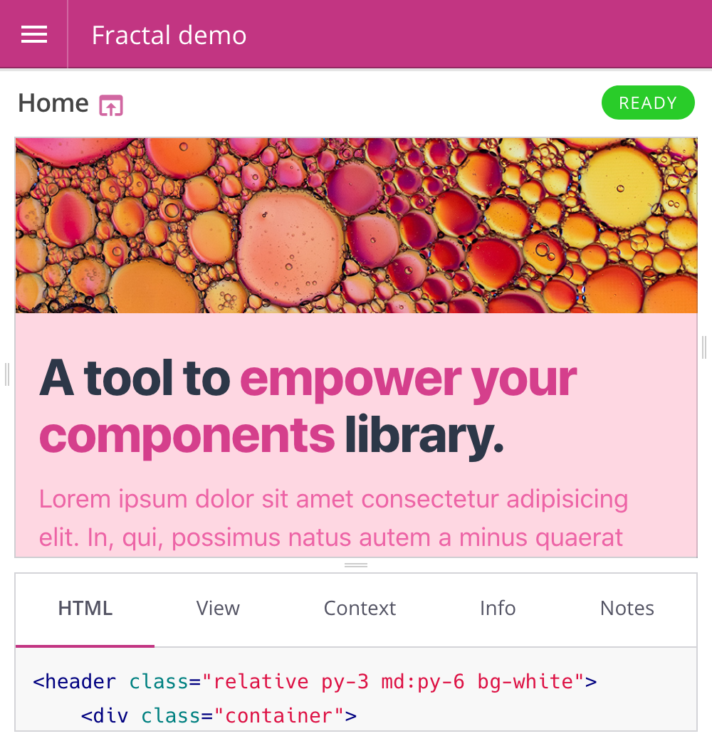
Mandelbrot (opens new window) is the name of the default web UI theme that ships with Fractal. A standard installation will look something like this:
# Configuration
Mandelbrot offers some theme-specific configuration options. Configuration properties can be set when initialising a new instance of the theme:
// require the Mandelbrot theme module
const mandelbrot = require('@frctl/mandelbrot');

// create a new instance with custom config options
const myCustomisedTheme = mandelbrot({
    skin: 'fuchsia',
    // any other theme configuration values here
});

// tell Fractal to use the configured theme by default
fractal.web.theme(myCustomisedTheme);
TIP
You will need to run npm install --save @frctl/mandelbrot within your project directory before you can require() it in your project settings file.
# skin
Mandelbrot offers a pre-defined set of colour 'skins' that you can apply to the UI for quick and easy customisation.
{
    skin: 'lime'
}
- Choices:
aqua|black|blue|default|fuchsia|green|grey|lime|maroon|navy|olive|orange|purple|red|teal|white|yellow - Default:
default(blue)
# Specifying custom colors added in v1.5.0
The skin option can also be specified as an object in order to customize the chosen skin with custom colors.
{
    skin: {
        name: 'default',
        accent: '#f2d',
        complement: '#402',
        links: '#a06',
    }
}
NOTICE
Only hex colors are supported.
WARNING
Custom colors are not applied in browsers that do not support CSS variables (opens new window). In those browsers, users see the bare skin specified in skin.name.
# format
The format to use when outputting context data.
{
    format: 'yaml'
}
- Choices:
json|yaml - Default:
json
# nav
The nav sections that should show up in the sidebar (and in which order):
{
    // show "docs" above "components" in the sidebar and hide "information"
    nav: ['search', 'docs', 'components']
}
- Possible values:
docscomponentssearchadded in v1.3.0informationadded in v1.3.0
- Default:
['search', 'components', 'docs', 'information']
# navigation added in v1.10
Determine whether to use a single-column sidebar (variants appear directly beneath their main component) or a two-column sidebar (variants appear in a second column, after the main component has been selected in the first column).
{
  // use the new 'split' format sidebar
  navigation: 'split'
}
- Possible values:
defaultsplit
# panels
The component info panels that should be displayed in the component browser (and in which order the tabs should be displayed):
{
    panels: ['html', 'view', 'context', 'resources', 'info', 'notes']
}
- Possible values:
html,view,context,resources,info,notes - Default:
['html', 'view', 'context', 'resources', 'info', 'notes']
# styles
The URL of a stylesheet to apply the to the UI. If none is specified then the appropriate Mandelbrot stylesheet for the chosen skin value (see above) will be used instead.
{
    styles: 'http://mega-corp.com/css/custom-mandelbrot-stylesheet.css'
}
This option can also take an array of stylesheets URLs to use. If you do not wish to replace the default stylesheet, but instead want to add an additional stylesheet before or after it, you can use the default placeholder value and Mandelbrot will expand that out into the correct URL before use. For example:
{
    styles: [
        'http://mega-corp.com/css/custom-mandelbrot-stylesheet.css',
        'default',
        '/another/stylesheet.css'
    ]
}
In this case the default Mandelbrot stylesheet link will be output between the two other custom styleheets.
WARNING
This option is not used for applying styles to your components - for information on how to include component stylesheets see the docs on linking to static assets.
# highlightStyles added in v1.4.0
Works similarly to the previous styles option, but only affects code blocks highlighted by highlight.js (opens new window).
{
    highlightStyles: 'https://cdnjs.cloudflare.com/ajax/libs/highlight.js/9.5.0/styles/monokai.min.css'
}
- Default:
'default' - Required core version:
@frctl/fractal@v1.3.0
# scripts
URL for the JavaScript file to use in the Mandelbrot UI. If none is specified then the default Mandelbrot JS file will be used instead.
{
    scripts: 'http://mega-corp.com/js/custom-mandelbrot-scripts.js'
}
This option can also take an array of JavaScript file URLs to use. If you do not wish to replace the default JS, but instead want to add a additional scripts before or after it, you can use the default placeholder value and Mandelbrot will expand that out into the correct URL before use. For example:
{
    scripts: [
        'http://mega-corp.com/js/custom-mandelbrot-scripts.js',
        'default',
        '/another/script.js'
    ]
}
In this case the default Mandelbrot script tag link will be output between the two other custom script sources.
WARNING
This option is not used for applying JavaScript to your components - for information on how to include component JS files see the docs on linking to static assets.
# lang
Specify the value of the lang attribute that is applied to the html element.
{
    lang: 'fr'
}
- Default:
'en'
To translate the interface, see labels below.
# rtl
Switch the theme into RTL mode.
{
    rtl: true
}
- Default:
false
# static.mount
Virtual path prefix for the theme's static assets. The value of this is prepended to the generated theme static asset URLs.
{
    static: {
        mount: 'no-clash', // Theme asset URLs would now look something like: '/no-clash/path/to/file.js'
    }
}
- Default:
_theme
# favicon
The favicon file to be displayed by browsers.
{
    favicon: '/custom/path/to/favicon.ico'
}
- Default: it will look for a file named
favicon.icoin the folder defined as thestatic.mountoption described above.
# labels
Customize labels used in the templates, useful for translating the interface for example.
{
    labels: {
        search: {
            placeholder: 'Rechercher…',
        },
    },
}
Default:
{
    info: 'Information',
    builtOn: 'Built on',
    search: {
        label: 'Search',
        placeholder: 'Search…',
        clear: 'Clear search',
    },
    tree: {
        collapse: 'Collapse tree',
    },
    components: {
        handle: 'Handle',
        tags: 'Tags',
        variants: 'Variants',
        context: {
            empty: 'No context defined.',
        },
        notes: {
            empty: 'No notes defined.',
        },
        preview: {
            label: 'Preview',
            withLayout: 'With layout',
            componentOnly: 'Component only',
        },
        path: 'Filesystem Path',
        references: 'References',
        referenced: 'Referenced by',
        resources: {
            file: 'File',
            content: 'Content',
            previewUnavailable: 'Previews are currently not available for this file type.',
            url: 'URL',
            path: 'Filesystem Path',
            size: 'Size',
        },
    },
    panels: {
        html: 'HTML',
        view: 'View',
        context: 'Context',
        resources: 'Resources',
        info: 'Info',
        notes: 'Notes',
    },
}
# information added in v1.6.0
Define the content of the navigation’s “information” block (see nav option above). This can be used to display a build date or the library version for example.
{
    information: [
        {
            label: 'Version',
            value: require('./package.json').version,
        },
        {
            label: 'Built on',
            value: new Date(),
            type: 'time', // Outputs a <time /> HTML tag
            format: (value) => {
                return value.toLocaleDateString('en');
            }
        }
    ],
}
Default:
[
    {
        label: config.labels.builtOn, // See "labels" section above
        value: new Date(),
        type: 'time',
        format: (value) => {
            return value.toLocaleDateString(config.lang);
        },
    },
]
# Template customisation
Mandelbrot (as with all themes) uses Nunjucks (opens new window) templates to generate its HTML. The source code for these templates can be seen in the views directory of the Mandelbrot repository (opens new window).
To override the contents of any of Mandelbrot's templates you can specify a custom views directory within your own Fractal project using the theme.addLoadPath() method:
const myCustomisedTheme = require('@frctl/mandelbrot')({
    // theme config here
});

// specify a directory to hold the theme override templates
myCustomisedTheme.addLoadPath(__dirname + '/theme-overrides');

fractal.web.theme(myCustomisedTheme);
Any templates within this directory will be used in preference to those of the same name within the Mandelbrot views directory. This allows you to copy a template from the Mandelbrot repo into your own project and adjust it to your liking. The next time you start up the web UI it will use your custom template instead of the default one.
TIP
You do not need to copy all of Mandelbrot's templates into your own theme templates directory - you should only create templates to override the specific parts of the UI that you want to adjust.